“Better Together” ad campaign
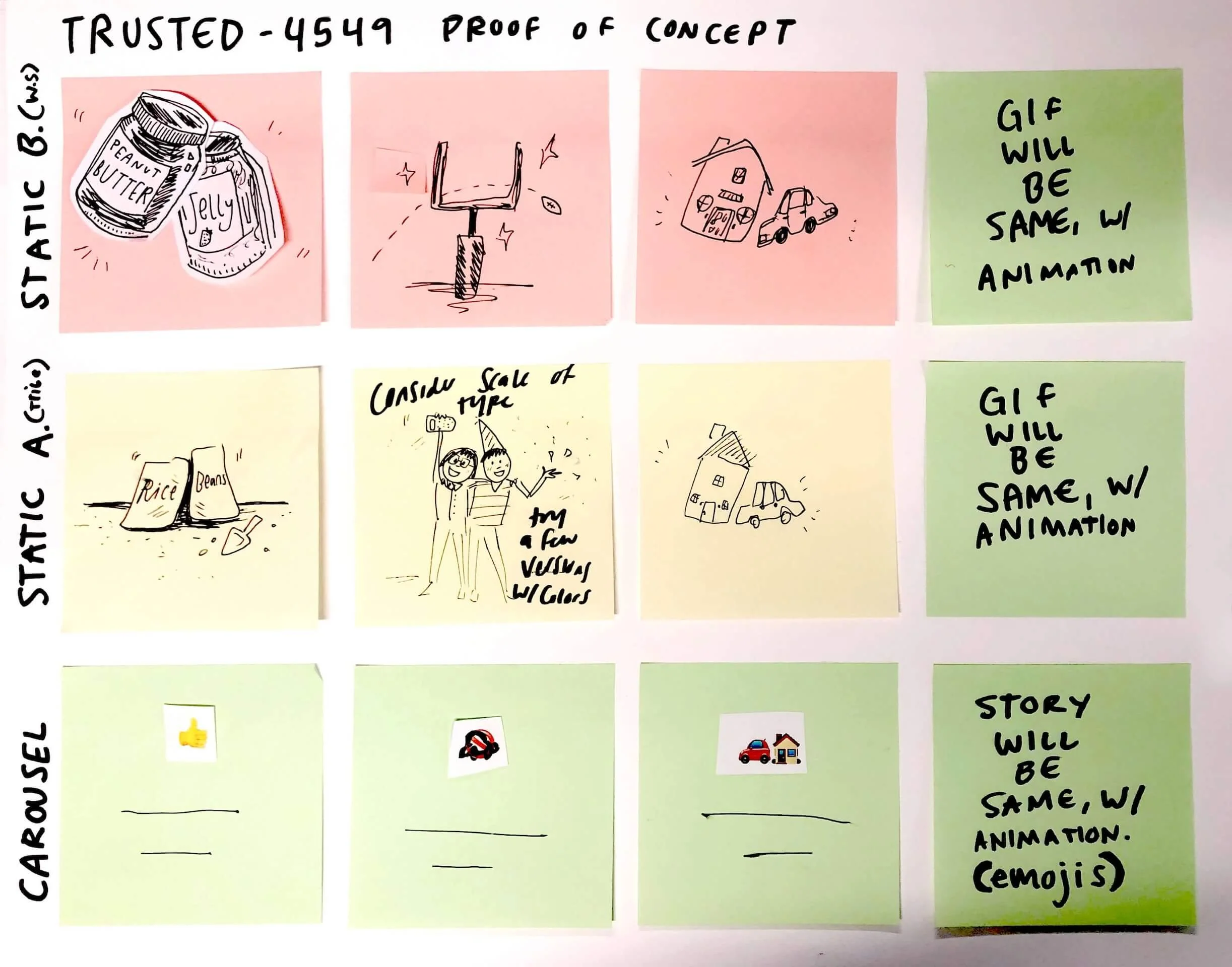
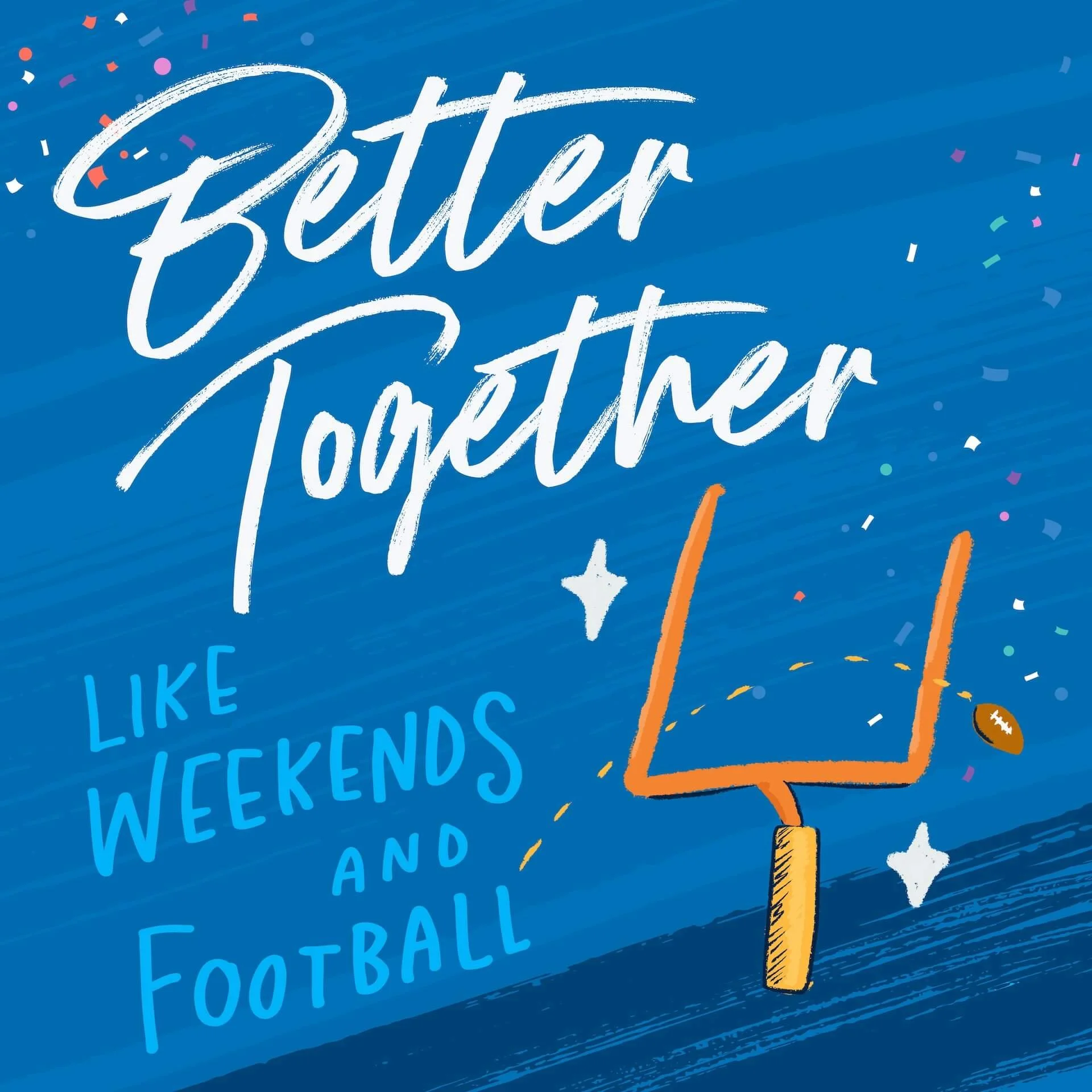
While I worked for Ramsey Solutions, there was a strict “no stock photography” rule in place. This existed to help create more human-centered and real life imagery. However, it also meant for some ads, we leaned heavier on illustration as a way to communicate warmth and human-ness.
For these ads, it was crucial to distinguish which were designed for folks familiar with the Ramsey brand and language, and which were designed for white space.
Client: Ramsey Solutions
Discipline: Marketing Strategy, Illustration
Marketing for white space vs. brand aware
White Space
Have not meaningfully engaged with brand
Unfamiliar with language
More of a “blank slate”
Need to use general, easy-to-interpret language
Brand-Aware
Engaged with the brand previously
Familiar with language
More sense of belonging
Able to use specific lingo and “inside jokes”
Designing for bundling insurance
The purpose of this ad set was to encourage people in our target demographic to consider bundling their insurance to save money. Before designing, I met with the digital marketer for this space and made sure I understood the requirements and what we hoped these ads would accomplish.
When designing ad sets (especially for Meta and Google, I like to provide multiple options so that we can test them against each other, see which ones are more successful, and learn from the experience.


